A button is the smallest interactive interface element and one of the most important ones. After all, it’s the button that largely determines the user’s interaction with the system and his further actions on the site or in the application. The button should be thought through in all the details: shape, design, text, location, and so on. Read about all of these nuances, as well as the related design patterns, in this article.
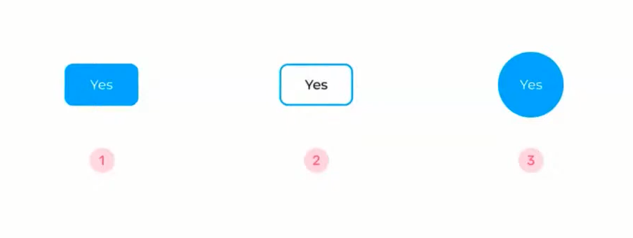
Before getting into the details of the topic, here’s a little interaction experiment. Which of the following buttons do you think is better? Right away that this is a trick question, as you will learn when you read the article.
Types of Buttons in the Interface
There are six common types of buttons, and here are details of them:
- Fill buttons. Typically used for the main action on the site. This is probably the most recognizable type of button, its established pattern. Any users, whether adults or children, will understand that in this case they are dealing with an interactive button.
- Contour buttons. These are also called ghost buttons. They have no fill, but only a stroke. Most often this type of button is used for secondary actions, like undo or back. But they can also be primary actions. For example, the Mozilla site has two outline buttons on the first screen for targeting. You can also see filled buttons below the page, though.
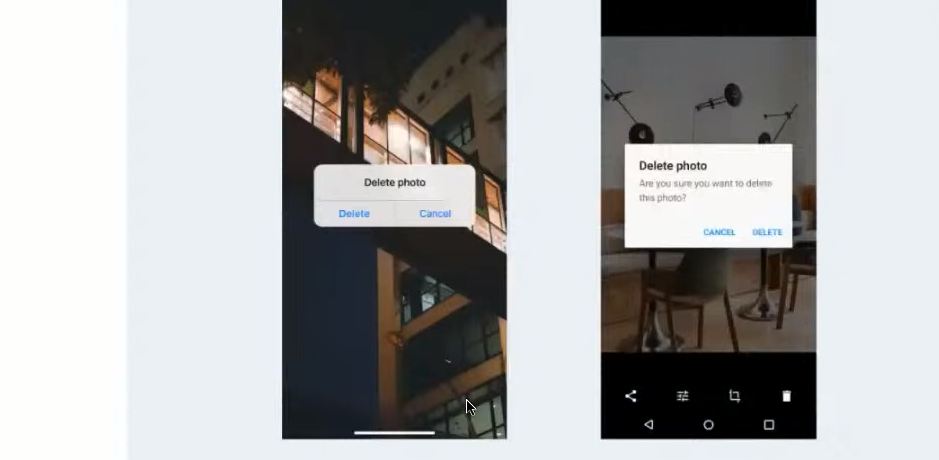
- Text buttons. Some designers say these are not buttons, but links. After all, they look like text without the visually highlighted frame. However, between the two concepts there is still a difference. The link leads to another page, and the button is responsible for completing the action. Today, text buttons are particularly common in mobile interfaces and applications on iOS and Android. For example, in the modal windows of both operating systems are only text buttons. They are also often found on websites.
- Icon buttons. These buttons have no text—they have a picture or an icon. They are usually used in systems and products. The main purpose of these buttons is to reduce the visual burden on the user when he understands the meaning of the button from the context. In the example below, in Google tables, the only action is to enter an existing table or create a new one. So you don’t need to add a huge Add New Table button here. In context, the commonly used plus sign is enough. It’s the same in Figma, where you don’t need to make a caption for each tool in the tool set. The user understands if he clicks on a rectangle, he can draw a rectangle. And sometimes the look of the buttons can change depending on the settings, the user’s expertise, etc.
- Split buttons. These are composite buttons with multiple actions. Most often this solution is used in applications and services to save space and when there are equal actions. For example, Vimeo has a New Video button. When you click on it, a menu opens: upload or create a new video. With split buttons you could also talk about Skype or Figma. In the latter case, even the selection of shapes is essentially a button. When the user points the cursor at an element, he sees a change in the state of that element, and a list of available functions pops up: rectangle, oval, etc.
- Mixed buttons. These can be filled buttons, outline buttons, and text buttons, but all have an icon. They can be created as split, with a drop-down list of actions, or a combination of these approaches. One of the most common types of this design is on IBM’s site, where the text buttons are complemented by arrows.
Selecting the Button Type
There are many types of buttons, but which one is better to use? You can argue about this for a long time, but the advice of Google can resolve disagreements: it is worth it to be guided by the frequency of their use in the interface and the number of actions for the user. That is, if one screen presents a single action, choose the fill button. If the screen can do 27 actions, you can not put 27 filled buttons. This will disperse a person’s attention. In this case, you will have to choose different types of buttons for different actions.
Consider the catalog at Rosetka. You can’t add a Buy button to every card—that’s overkill. The most important action should be defined. In the catalog, it’s searching for a product, that’s why there’s only one button —Find. If the buyer goes to the card, it is already filled with a green button, Buy. Yes, there is an icon of a cart next to the card, but it’s inconspicuous. After all there are many other actions: comparison, favorites, sections, prices, reviews, top sellers, and super price. It’s simply impossible to highlight everything.
This raises an interesting question: how does the user know that Top Sellers and Super Price are not buttons? After all, they are filled, and there is text on them. There are several factors that can be used to figure this out.
For example, the text is clearly not a button. The location in the upper left corner is important. Still, the Buy button would be at the bottom under the photo next to the price. This would have helped build some sort of logical narrative: photo, headline, price and button to buy. It’s also important that the buttons have more whitespace around the text. This is something you should definitely pay attention to. When you make a button, its background shouldn’t just be a substrate for the text—the button should stand out prominently.
Button States
For all types of buttons, you need to think about the states of these elements. In this article, six basic states are highlighted. Often, though, designers don’t even use these six, limiting themselves to a smaller set.
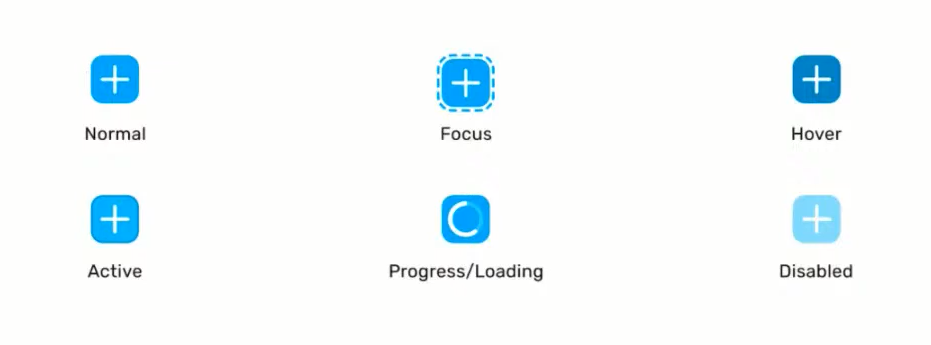
- Normal. Normal state of the button. Indicates that the item is active and ready for interaction with the user.
- Focus. Appears when a button is highlighted through the keyboard (say, when you press Tab to toggle between clickable items). This state also helps users with specific input devices. For example, for blind people, there are screen readers that read what’s happening on the screen. Even if the designer doesn’t draw Focus, the developer will make it so that the screen reader can see this button state. It is usually very accentuated. A person with congenital blindness doesn’t care, but a person with colorblindness or temporary vision problems should be able to see the change in appearance of the button. Usually a simple bold stroke is made, sometimes in a different color. The illustration above is an example of an outline stroke from Smashing Magazine.
- Hover. Another state of item selection, but not by pressing buttons on the keyboard, but by hovering the cursor. Note: this is not the same as Focus. Hover responds to hovering, not clicking. Usually this state is depicted with the button’s native color dimmed or highlighted.
- Active. In fact, this is the state of pressing the button itself. This mode has several purposes. First, the button itself may need the active state. For example, in a graphical editor, you click on a rectangle button and draw, and the button is “active” all the time. Secondly, Active is needed to confirm the click itself. Yes, a normal person clicks and doesn’t even notice this state of the button, it disappears quickly. But if the user presses the button with his mouse and holds it, the change will be noticeable.
- Progress/Loading. This status indicates the execution of a process started by the user. It is useful for systems that are not technically fast in responding to clicks. While the request is being sent to the server, processed, and returned, you need to show the user that something is currently happening. This is what the state of the button is for.
- Disabled. The state for a button that is unavailable for some reason. This may be needed, for example, when the user needs to fill in several fields on the site before proceeding to the next page. Until the condition is met, the button is not clickable. Some designers believe that in this situation, the button can have a Normal look. However, if all the conditions are not met, the system displays an error in the form of “All fields are required.” Only you should take into account that sometimes the user does not understand that the button is not active and why it is so. In this case, he has to hover over it, and then the system needs to show a tooltip from the “Fill in fields 1, 2, 3 to make the button available” series. According to Google, it is necessary to give the user the opportunity to click on the button, and then display a message for him to meet some conditions for access to the button.
Button Sizes
When designing interfaces, one often mentions Fitts’ Law. It states that the time to reach a target is directly proportional to the distance to the target and inversely proportional to the size of the target. Simply put, the bigger the object, the easier it is to hit it. You have to make the button pretty big to be able to interact with it comfortably. There is no one universally accepted size, but the button should be larger than 40 pixels. It is true that even some of the examples cited had buttons smaller than this parameter (text or burgers). Therefore it is more correct to say that 40 pixels is a clickable area. That is, the button can be made small, but the clickable area must be larger than the button itself. This allows the user to click on the button when hovering over it without aiming specifically at the text or a small symbol.
The following picture is a recommendation from the internet: the letter indent should be like two w’s for horizontal and one w for vertical indent.

But this is only advice, not a hard-and-fast rule. Most likely the text in the button should be the same size as the typeset. Then there will be no conflict that something is too small or too big. As for the whitespace around the text, it’s better that you develop a mindset. The more you look at interfaces, the faster you’ll come to understand how much space is needed around the letters.
Button Shapes
Now try to determine the best of the following forms of buttons. In terms of recognizability of the pattern the unconditional leader is option 1. But in fact, when choosing the form of the button, you should be guided by the task it is supposed to solve.

Here’s an example of a website from the portfolio of a design studio. The designers were obviously tired of standard rectangular buttons. In this case, the cursor changes when you hover over the object and, in fact, itself becomes a button. This “button” is iconic, in the form of an eye, and means “Look.”
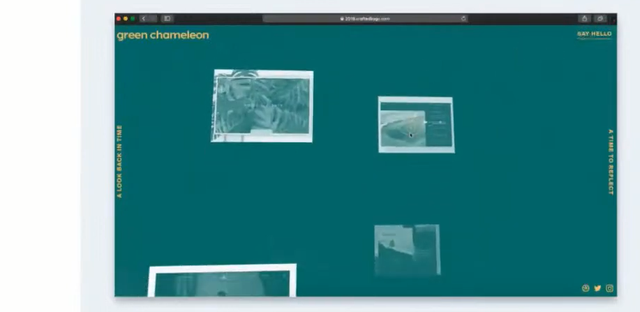
Another example: here the cursor turns into a circular “View” button when hovering over an interactive element.
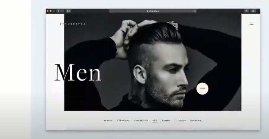
When determining the form of a button, remember: if the task is to make something beautiful and unusual, and the subject of the project has to wow the user, you can create buttons as round, triangular, or whatever you want. For example, in developing a site design art house cinema festival or a site for artists, such experiments are welcome
In the case of conservative orders, show your creativity carefully. Even if the customer wants something unconventional, he may not accept the original project. Not all users will understand such creativity, they say. After all, it’s important to the client that everyone can use his service. Therefore, discuss with him in detail the vision of the project and do not complicate your task with experiments, as opposed to “boring” but working buttons.
Text on Buttons
You managed to figure out one button, but what about two? Imagine you see a message on the screen of your device: “Are you sure you want to continue connecting?” Which pair of answers is better to present in the modal window: “Yes/No” or “Cancel/Connect”?

At first “Yes/No” seems like a good solution. The text takes up little space, and the person is less likely to read. But there is a problem: if you close the message at the top, the values “Yes” and “No” will be incomprehensible. It all depends on the wording in the modal window. In the second case, the user understands from the context: it connects to something. As a result, it is enough to read the text on one button to make a decision. In the first case, it is necessary to read the entire message.
In the information window, where it says that the purchase is made and shipped, “Ok” looks quite logical. There’s no point in writing “It’s clear to me that my item is on its way to me.” But when the user needs to make a decision, it’s better to make clear button captions. A UX writer can help with that. The specialist creates captions for the interface, not as marketing copywriting, but for the user’s convenience. But often the UX writer is the designer on the team. Therefore, he should understand how the user considers the text on the button.
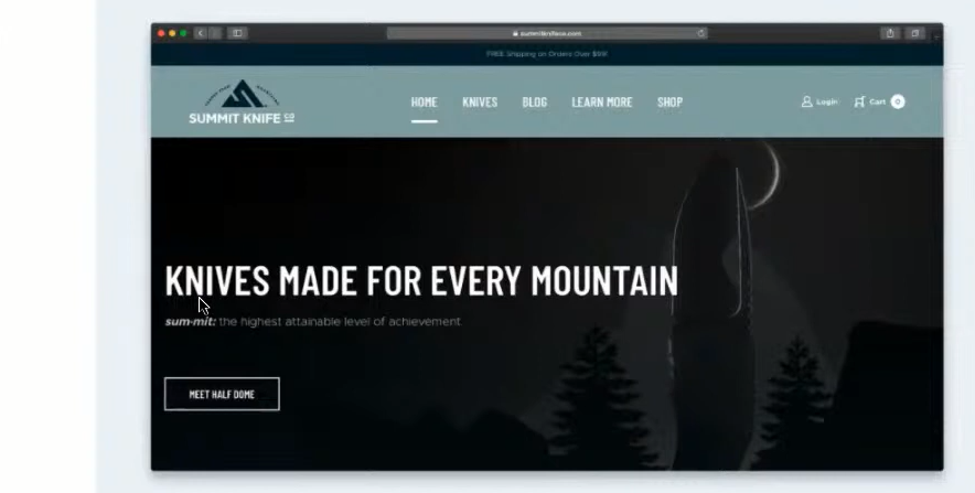
Let’s take a look at this knife website. The store has a model called Half Dome, and the text on the button reads, “Meet the Half Dome.” But it’s not clear what that means. Will the user add the knife to the cart or get to the sales page? Or maybe go to YouTube to watch a video about the new product? In the end, the person doesn’t understand what’s about to happen.
Or another example—note here the button: big, square, with an arrow. It’s eye-catching, but—there’s also a second: the text “Start investing.” What does this mean? The user can ask a lot of questions: where to invest, how it works, where will I go after clicking on the button, will I have money deducted from my account now, or what? It is important that the person on the button understands exactly what will happen after the click.
Button Accents
Once again, choose the best pair of buttons. Skip or Sign Up—which layout would you prefer?

For the answer, it is important to understand what is written on the buttons and what the message is here. When you highlight the button in the first case, it is as if you are saying, “Register.” But people don’t like to hand over personal information like email address, and phone number by default. And here it’s as if the choice has already been made for the person. Yes, businesses often make it clear: we need registrations. But it’s better to let users choose what they want. For example, on Nike’s site, it reads: “We are taking votes. You can register or learn more.” The buttons are equal, the choice is up to the person.
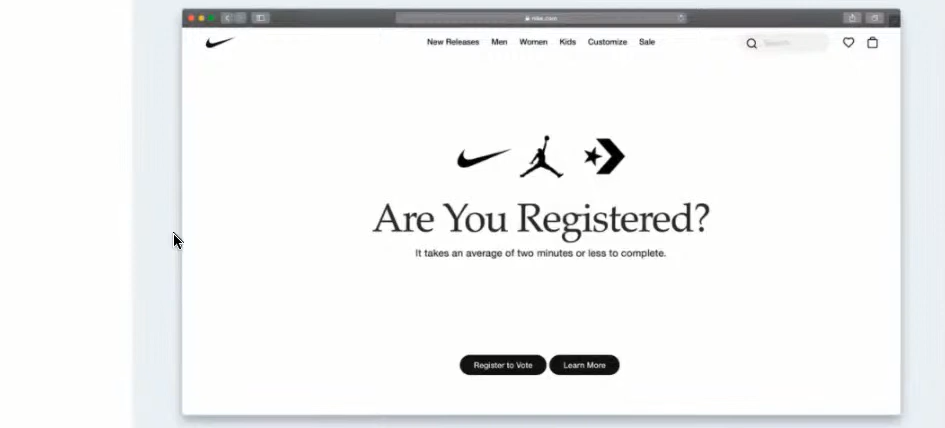
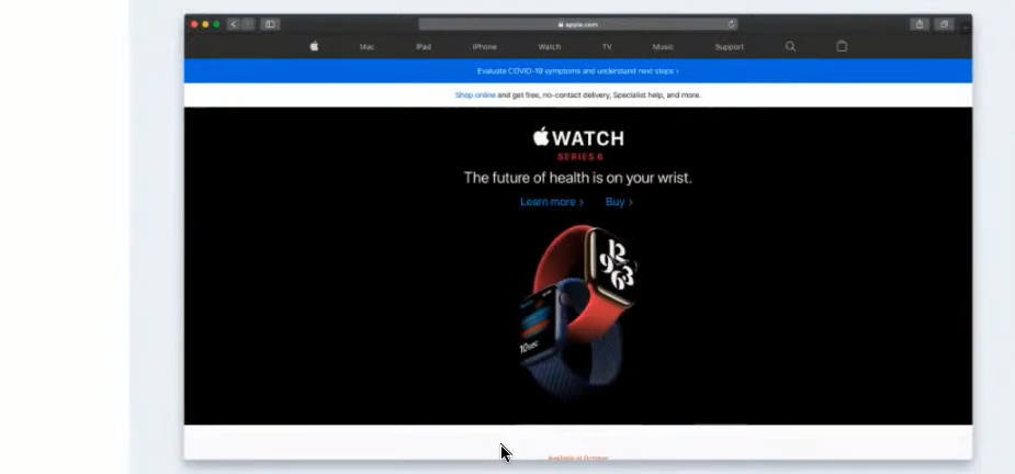
Apple has a similar situation on their watch page. There are similarly designed text buttons with an icon: Learn More and Buy. Customers often ask for a huge red Buy button. Apple, on the other hand, invites the user to make their own buying decision.
Look at how Apple’s macOS shows priority to the user. When you try to delete a file from the trash bin, they highlight the Cancel button. Yes, they have made a decision on what to accentuate the user, but the action is irreversible. Even though the user himself clicked on delete, he should understand what the consequences would be. In this way, designers help a person prevent an irreversible action from being performed.
Button layout
At the end, another example riddle. Here are Save and Cancel buttons, and they have the same priority. The question is location: which button should come first?

In fact, there is no single correct answer. The Nielsen Norman Group, whose co-founder coined the term UX, has proven that these solutions are equivalent. In one case, it’s possible to put the action for which the user has requested the system up front. In the other, it’s to allow the user to first familiarize themselves with the options.
Conclusion
Which button is the best shape? The answer to this question depends on several factors, including the number of buttons and the style of the project as a whole. How do we show that we have a button in front of us? This can be done through form, context, and states. You need to be clear about which button states are required and for which actions, as well as how readable the text on the button is. And remember: despite the fact that a button is a small interface detail, you need to think about it just as thoroughly as larger elements.
