In this article, will be explained why the privacy policy and terms of use should also be considered during the design process. This will be potentially useful for all IT professionals who want to take care of their users and communicate information to them clearly.
It’s a fact that when creating a cool UX, everything is necessary: from the background shade to the style of the text in the tooltip. And it’s just as important to tell users transparently and clearly what happens to their data on the site. Let’s find out together what you can do about it.
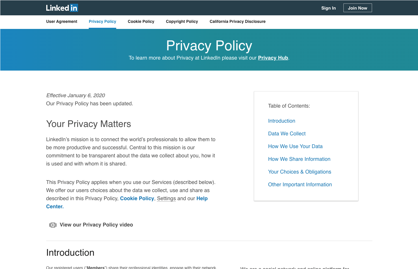
Your Privacy Matters
Privacy policy and terms of use, for the most part, are considered not just secondary but almost unnecessary sections of the site. They are put up just to check all their boxes especially without paying attention to the quality of the text and formatting. However, it turns out that this way spoils the UX and hides important information from users about their rights.
Recently, there was a case where the project team was faced with a difficult challenge. They had to show the privacy policy text to a specific group of users due to the peculiarities of the legislation of their country. A simple “I have read and agree” box that you could just click on wasn’t enough. Remember: even that one quick click often annoys people— even more so when somebody is forced to look at a large amount of text. So experts thought, how can they formulate and display the privacy policy so that the users won’t hate them?
Common Mistakes When Developing the Privacy Policy
What is known about how this mysterious section should be designed? Pioneers in the field of UX research, Nielsen Norman Group, conducted a study in which they asked respondents about their experience with the privacy policy of some resources. Specialists ensured that the study did not involve stakeholders such as UX designers, other IT employees, or lawyers.
It turns out that users (buckle up) go into this information if they have specific questions regarding their rights. So it was the users who helped identify the most popular mistakes when formulating the privacy policy. Let’s look at them in more detail.
1. The text is written so you will get a headache reading it
The text of the privacy policy and terms of use, in most cases, is written by lawyers or simply copied from the internet. As a result, it’s just a long list of terms that most people don’t understand. Nielsen Norman Group interviewees felt the text was written for other lawyers, not for them. Respondents had the feeling that important information was being hidden from them behind the intricacies of legal phrases.
At the same time, study participants wanted a simple human language that could help them:
- Understand what behavior on the site is unacceptable and why
- Learn their personal data is collected and why it is needed
- Answer the question: Who has access to this data?
Solution: Write the privacy policy and terms of use in as simple language as possible.
You probably can’t turn off the legal jargon completely, but you can add a short disclaimer before each section of what will be discussed below, written as simply and plainly as possible. If possible, add a specific example of how this or that Privacy aspect affects your users.

2. Lack of formatting
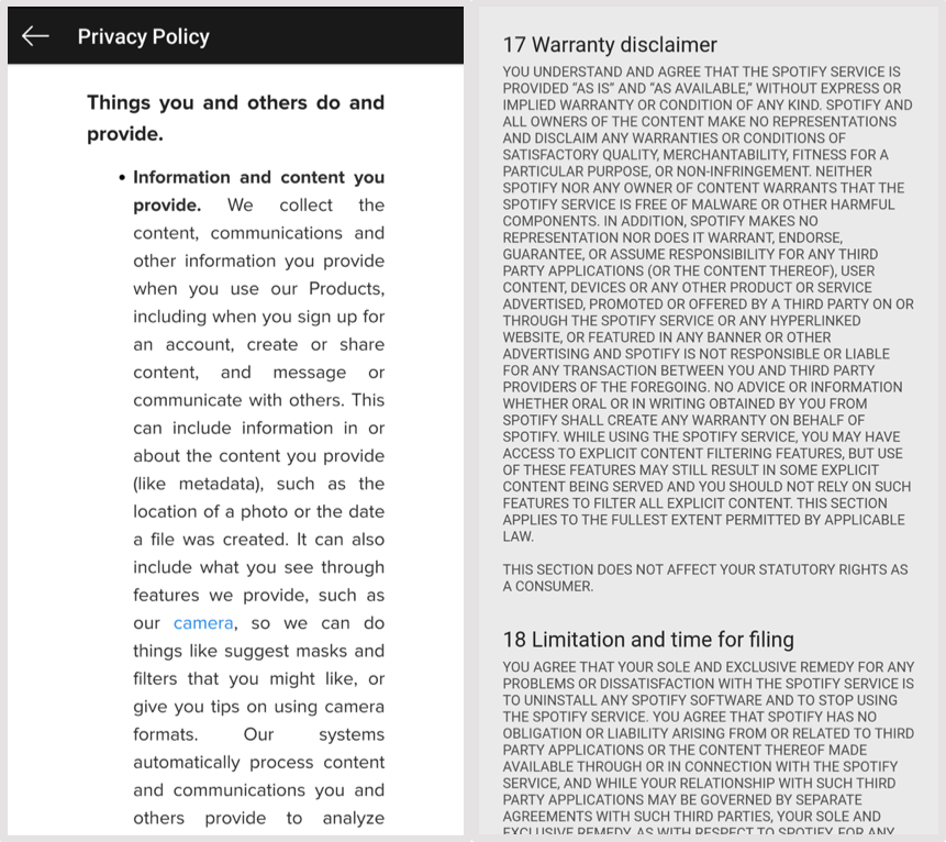
Often, the Privacy section highlights small text or huge paragraphs with no whitespace or in ALL CAPS. Seeing this approach to formulating text about their rights, study participants felt a certain unease, as if the company was again hiding something important behind a sheet of unformatted text.

Solution:
- Use at least a 14pt font
- Highlight important phrases and headings
- Make sure the text is readable on all devices

And the excessive use of caps lock looks like YOU ARE YELLING AT YOUR USER.
3. Lack of functional navigation
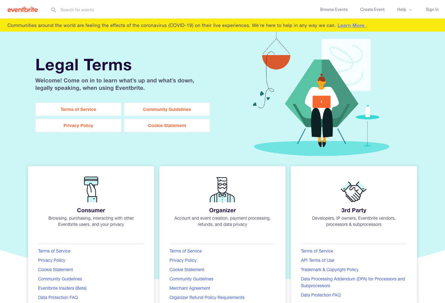
Many of the resources that were the subject of the study decided not to separate their content into sections and corresponding tabs. At the same time, if users come to the privacy page, they are looking for an answer to a specific question, which concerns a particular section, and not the “Hey, why not read an extra 10 pages of text about the policy of using the site?” For example, a user may agree to the use of cookies, but obscure partners who have access to his data seem suspicious to him. If the user cannot quickly find the information that interests him, the resource begins to look less transparent in his eyes.
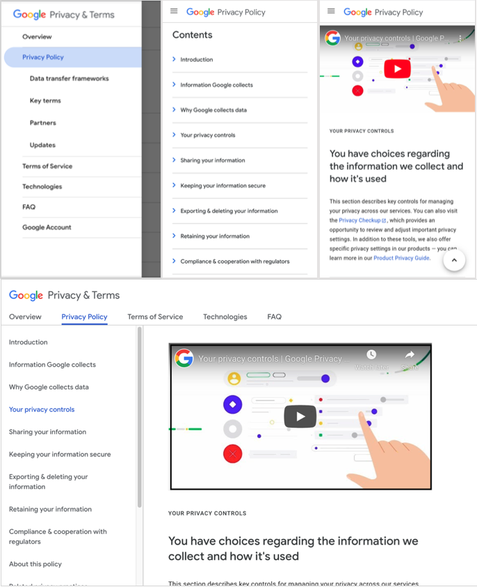
Solution: Use transparent and detailed navigation with a link to specific sections of the privacy policy.

Even better would be to place the ability to navigate between them, for example, on the left as a left-side menu, so that the navigation is always at your fingertips.
If using all the tips mentioned above on the project, forming a new solution. Highlight the key points of each privacy policy section, write them in plain language, and place them on one screen without scrolling so you can open the full version of each section and read more about them.
Looking for the Right Tone of Voice for Privacy Policy
Remember to stick to the same style you chose to communicate with the user. It should also appear in your privacy policy and terms of use. Here are a few recommendations:
Explore your audience. Who are these people? What is their social status, age, gender, location, etc.? To answer these and other questions, talk to them. The most obvious way is through questionnaires, interviews, and other methods of audience analysis.
In small projects with relatively low budgets, you might start to think that UX interviews exist only in theory, but no. There are many teams that have a specialist who only does audience research. When you watch one of the interviews, you almost cry. Here it is, the canonical design process. There he is, your user. The American medical student is young, energetic, and focused on the education process. His goal is not just to get a diploma, but to become a professional, so he is looking for quality support materials, one of which was the application.
Now let’s compare appealing to an abstract someone or specifically him—the difference is obvious.
Look for your balance. There are four main aspects to the tone of voice:
- Funny/serious: do you want to make jokes with the user, or are you a business dude who doesn’t care for jokes?
- Formal/non-formal: are the user and you bros, or do you keep a distance, normalized by the etiquette?
- Always shows respect/brings condescending: Is it three-tiered respect for the shifter you’re talking about, or are you embarrassed to be condescending?
- Passionate and emotional/voices only facts: do you allow yourself to be passionate about the subject of the conversation, or do you dryly describe its essence?
You can choose an extreme manifestation of each aspect or adjust their proportions to ourselves.
Be perfectionists. The devil hides in the details, and the quality of the product shows, including barely-noticeable things. The privacy policy section, created with thought and care for the user, unambiguously distinguishes the product of a higher level. This is precisely the kind of project worth working on—classy, subconsciously created—where feedback from the user and addressing their needs play a key role.
Conclusion
When designing the privacy policy and terms of use sections, remember to do this primarily for your users. People must clearly understand what they have and do not have the right to do with your product, what data of theirs is collected, and why. How to do it in your particular case is really up to you. In this article, there are recommendations from experts to help you do it more effectively.
They say good UX writing even cleans the karma of IT people. Let’s check it out! 🙂


