It’s hard to overestimate the significance of navigation. After all, it determines the way the user navigates between website pages and functions, as well as interacts with the interface itself. The larger the service, the more complicated the navigation, and the more time should be spent for creating and thinking about all related components. To simplify this task, we recommend to be guided by the tips in this article.
Logo placement
In your opinion, which of the two below navigation formats is better? Let’s assume that the circle is a logo and the stripes are the menu sections.
To answer this question, let’s reason logically. We read from left to right. The logo is one of the factors indicating where the user is. Therefore, when reading from left to right, the logo in the top left corner will immediately tell you which website the person visits.
The Nielsen Norman Group made the following experiment. A group of people were given a list of online stores with logos on the left, in the center and on the right and asked to buy trainers there. People didn’t know about experiment being tested. The day after purchase, people were asked to name the website where they bought their product. Result: people were more likely to remember the name of the store with the logo placed in the top left corner than the logo placed in the center or on the right.
This does not necessarily mean that the logo should be always placed in the top left corner. If a user buys iPhone from Apple’s official website, he/she probably remembers the name of the website anyway. So, the advice about logo placement rather applies to no-name brands. If you want people to remember the name of your website better, place your logo in the top left corner if you work with Western markets and on the right if you work with the customers from the Middle East.
Fixed menu
Different menu items may have different states, and it is not necessary to show them. If any user points at one item, at a second, at a third, he/she should understand which one is active and which one offers options. But this relates to the menu as a whole, the entire navigation block. Navigation may have different states depending on the user’s location even within one page. And the best example of this is a fixed menu. In this case, you need to think through in detail about the navigation appearance change.
Consider a multi-language website where the user can change languages. Usually, the icon for changing a language is placed in the top block. This raises the question: if a person visits this website and starts scrolling through the page, should the language switch button be placed in a fixed menu which is “glued” at the top of the screen? No, it shouldn’t. If such a feature is offered at the top navigation, the user shows by scrolling that he/she is satisfied with everything, and he/she does not need the language switch button.
The same goes for most other things. If you have a big logo in the top left corner, it is likely that people have already remembered where they are. So, when you scroll, you can make the logo smaller or remove part of it. For example, when the logo uses some symbol with the text, when scrolling you can leave this symbol without any text. This way, the logo will take up less space in the navigation. If there are five phone numbers, an address, a specific city of the user, and a language switch button, apart from the main navigation items, you should make the menu more concise while scrolling, if possible.
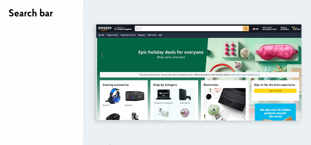
Search bar
Big online stores and services definitely need a search bar. It helps their users to obtain information they need and know about more quickly. If we talk about a promo site or a small site on 15 pages, seven of which are already represented in the main navigation, then the search bar can be safely avoided. If you really want to make it for users who know their search query, then make the search bar as an icon. By clicking on it a search bar will be opened to enter the text.
Logo
The first example from The New York Times is the one with the logo in the center.
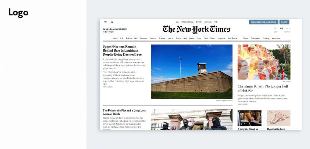
There are several reasons why they have arranged it this way. Firstly, they didn’t split the horizontal menu into two separate blocks: all elements are folded into a single menu. Secondly, this is the New York Times! In the US, people regularly read the same publications and know “their” journalists, and these are not some articles downloaded from Wikipedia. Therefore, website visitors already know that they have read the New York Times article and may even remember its author. In this case, logo placed in the center does not impact anything. On top of that, this website also looks like a newspaper, in part thanks to the logo placed in the center. This is in fact a stylistic solution as well.
Now there is another question: let’s imagine the mobile version of the clothing website and try to determine which navigation type shown below is better.
The first solution looks more elegant: navigation with all the sections is hidden in a burger. This solution saves some space, but in this case, the best solution would still be represented by the second option, where some of the sections are taken from the burger and are visible to the user. Such an approach will save the user`s extra clicks, and he/she can go directly to the desired section. Baymard calls it “Pay Per Click”: when any person needs something, he/she has to pay you as a service by clicking. We see a similar situation in one taxi service. Their app had a burger for the entire navigation, but buttons for selecting one’s address and destination address were always visible. After all, they are the main, most sought-after sections of the service.
Of course, there are many cases where it’s better to hide everything in a single navigation element. And sometimes you want to hide everything in a burger simply for aesthetic reasons. It is clear that it’s prettier and visually cleaner. But essentially, the burger is like a shelf, where you can put all sorts of sections you don’t really need. The main message is simple: if it’s something really important, don’t hide it. If people visit the site to search for men’s, women’s, and children’s clothes, show those sections at once. With regard to less important sections accessed by a small number of users, feel free to hide them.
It is important, as well, to remember: the entire home page as such can be used as a navigation. Let’s take Apple website as an example:
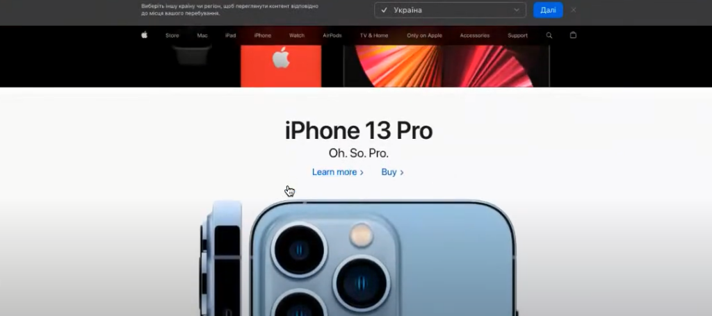
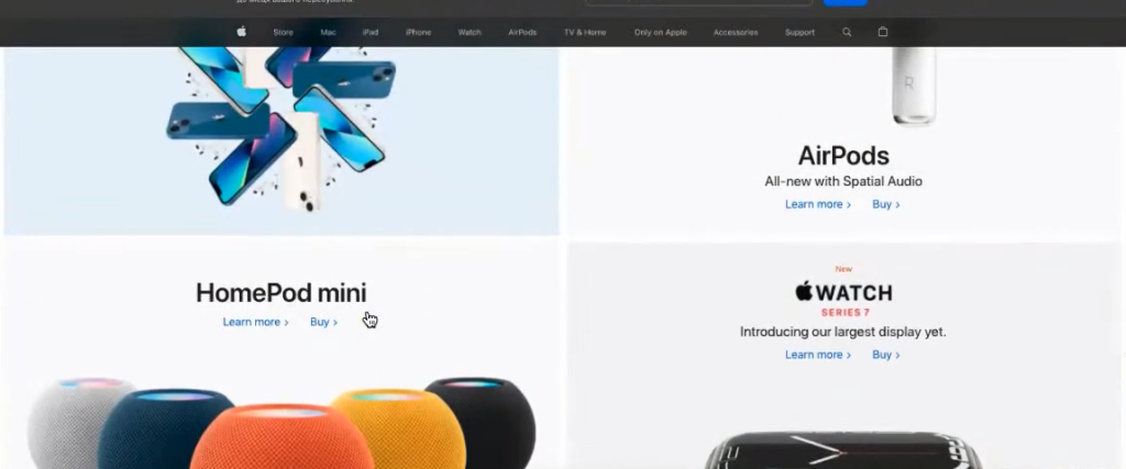
The first screen showed some sort of event with a button to go to in order to find out more about this event. Next was a similar block with iPhone 13 Pro and iPhone 13 and links to “Learn More” and “Buy”, below that were products, and so on. But what do such blocks really represent? In fact, all of these are section navigation, and the home page is just a continuous navigation with big cards and no typical “About Us” and “Our Benefits” texts. And there’s no burger in the top horizontal fixed menu either. But you should understand: this is far from representing navigation as a whole, and its scale can be estimated by the footer of the page:
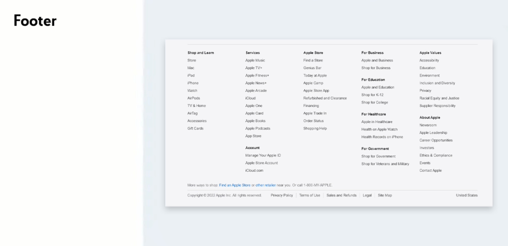
Horizontal block itself is a manifestation of hidden navigation. The site as a whole can look something like this, including preview. Sometimes even the “About Us” block mentioned above is designed as a card, with a photo and a “More” button in order to go to another page.
Hidden navigation
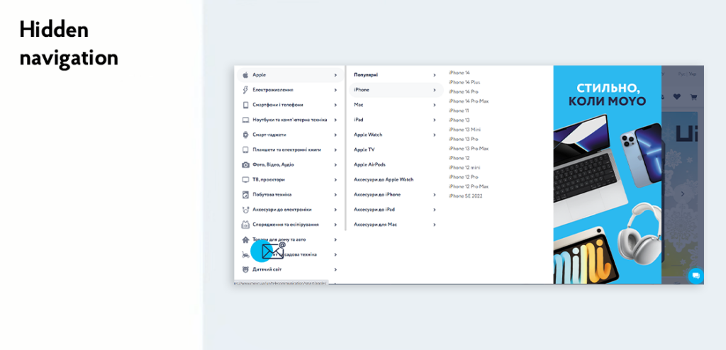
You should try not to hide anything both in the mobile version and on the desktop. The latter is especially important since there is a lot of space on the desktop. Let`s take a look at the Moyo website, where you have to click on “Catalogue” to view the catalogue of products. Now almost everyone’s home page already has the catalogue of products opened by default. And studies made by Baymard show: people do not want to lead the cursor first to the catalogue, then down to find the section in the drop-down menu, and then another right to the left to search for a subsection. It’s much easier to point to an item in a vertical menu, and then just move from left to right to navigate between menu levels. This way, the direction of the user’s attention is clearly defined and does not change.
Navigation placement
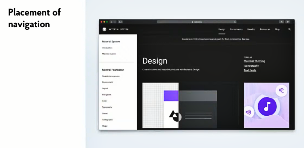
In terms of classic approach, it is better to choose the left and top parts of the screen for placing navigation. It can be also a multi-tiered menu, as Material Design has in the Figure below. The main sections are placed in the top navigation, while the subcategories are placed in a vertical box on the left side. In this example, a user is in the Design section (indicated by the underline bar), and the block on the left shows the sub-sections of the section. If any person goes to Components, the content of the sidebar on the left will also change.
Navigation state
It can be normal state, navigation state, focus states, etc. It also includes the states that tell the user what will happen when they click on an item. For example, what do you think will happen if the user clicks on Support in the following example?
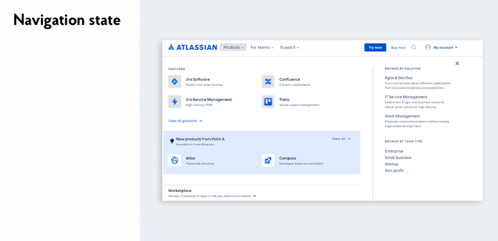
Most likely a drop-down list of support-related subsections will appear. This is indicated by a small arrow icon next to the section name which defines opening of some additional items. The user will think without it that he/she will go to another page. So, if you have a submenu, you should definitely add a similar arrow. This way you will meet the user’s expectations. Of course, he won’t leave the site if there is no arrow, and he/she was given some other list instead of a switching option. But this solution would still make the interface usage a little bit more convenient and clear.
This might seem obvious, but many sites avoid such an element. As a result, the user clicks on one section button to go to the next page, and after clicking on another button in the same menu block suddenly gets a drop-down list. Just because of this, the user doesn’t know what he/she should expect next.
Number of navigation items
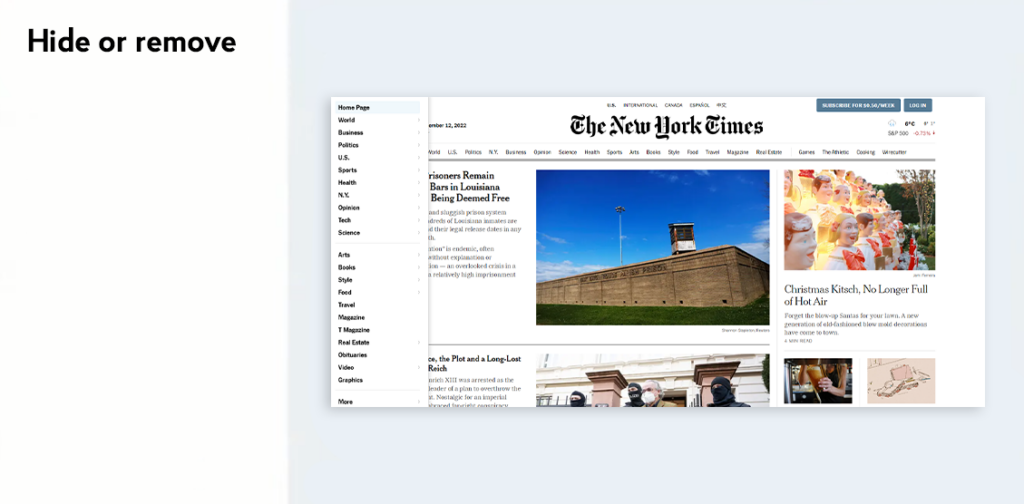
How many items should be used in the menu? To find the answer, let’s turn to Hick’s law: the more items we have in front of us, the more time it takes to choose. Although Hick did not say anything about the number of items, the Internet has derived an optimum value of 7-9 items based on his rule. The only problem is that in practice, there are not always 7-9 items, but much more. In this case, they can be hidden or removed. If we go back to the New York Times website, we can see the main navigation horizontally, but this is only part of the sections. In the top left corner, there is a burger with the rest of the navigation hidden. This is where the logo placement in the center played into the hands. After all, reading from left to right causes the user to notice the burger fairly quickly, while on the right it would be lost, and clicking probability would be greatly reduced. Also pay attention to the drop-down list itself. It’s not just big, it has a More button at the very bottom. You can imagine the scale of navigation over this resource, it’s simply gigantic!
There’s also the “Three Clicks Rule” on the Internet: a person should reach its goal in no more than three clicks. However, this is a myth. There is no proof that the user needs only three clicks, otherwise, he will get tired and leave the website. It is repeatedly confirmed in practice: people are willing to spend almost as much time searching for the information as needed. For example, if the user wants to buy some product, he or she will go round several websites, look at almost all the products offered, compare terms and conditions, and may even add the products to the cart and go through all the checkout stages, but still may not place an order today, and return tomorrow. In this case, there is no way to fit in three clicks. Therefore, it is better not to count the number of clicks, but to think how to make it convenient for a person to search for the information or product required at all technical and business stages.
Breakdown into stages
In some cases, it is possible and necessary to break navigation down into stages. For instance, the website of home appliance store Eldorado and most other online stores break down navigation into subcategories. Now they mostly break it in two nesting levels, but it can be more. Three is an optimal number.
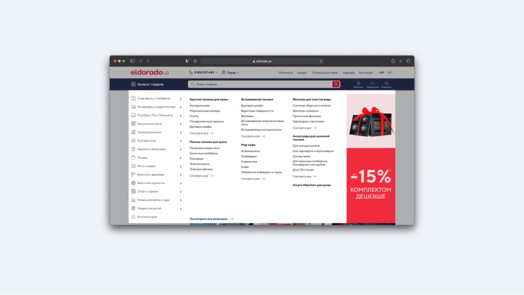
In example above, there is a problem. If a person on the second level forgot which section he/she is in, it’s difficult to determine. Since the items selected in the main block do not have an active state. This proves that even big companies make mistakes even if they are in small things. Therefore, analyze as many details as possible, and think through more scenarios.
A great number of categories
Perhaps the best example of a website with a great number of categories is Amazon. It’s a giant service where you can’t make a “staircase” of blocks consisting of 7-9 items. The simplest solution is to put everything in alphabetical order. This makes it easier for a person to find the section required. But there is no sense in using complicated terminology or special creativity. Everything should be clear at once.
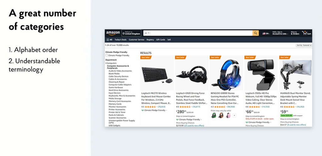
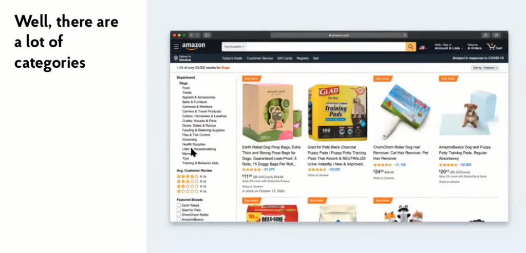
It should be noted how well Amazon has its subcategories placed. For example, in the case of dog products, the marketplace understands perfectly that people come primarily for two things: food and dog toys. Therefore, these two categories were taken from the general list and placed at the top of the list. Everything else was left in alphabetical order, as intended. However, it can be justified only when you clearly know what the vast majority of users need. It means that you can come up with and introduce a rule, and then break it if the situation allows.
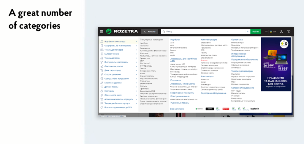
Another example is Rosetka. This store also has a lot of categories and subcategories, and there are a lot of questions about the catalogue. Firstly, nothing is placed in alphabetical order. Not everything is obvious with the popular products. Secondly, sub-categories within the category are not placed in alphabetic order either, nor are the items within them. It is extremely difficult to use the navigation on a website like this. Let’s imagine you need to buy children’s shoes. To find them here, you should go through every section and read all the texts within each section. Therefore, it is much easier to use a search engine here. For example, write “trainers for baby,” go to the product or category and then go to the section desired.
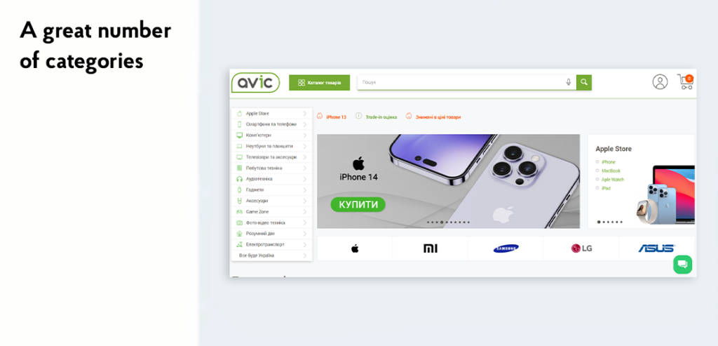
The online store Avic followed the Amazon principle: they placed the Apple Store section as the first item in the sidebar. However, they could place MacBooks under laptops, iPhones under smartphones, etc. But the retailer understands that people often buy home appliances of this brand. That’s why they designed a seemingly unnecessary menu item (although there aren’t even nine), but satisfied most customers by giving them what they needed right away.
Breadcrumbs
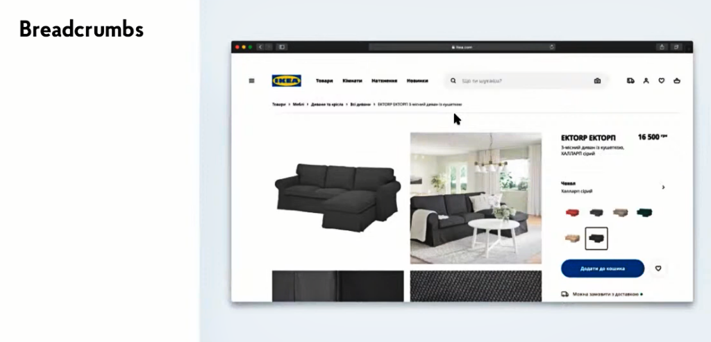
They show a user’s path within the interface and are used on larger services with more than two levels of nesting (section, subsection, another subsection within it, etc.). For example, on IKEA website user navigated through the “Goods”, then “Furniture”, then “Sofas and Chairs”, “All sofas”, and finally reached the card of a specific product. But thanks to the breadcrumbs a person can quickly return to the upper levels.
Wow-menu
All of the above navigations are common, which we use every day. But there are other options for designing such an interface element. An example is in front of you. This is the Bruno Simon website, a developer living in France, who received the Awwwards for this website. The navigation is organized here as follows: you use the buttons on the keyboard to control the car, and you have to go to Portfolio section, park the car next to it, and then this section opens up. It is clear, that not all people are able to cope with this task successfully.
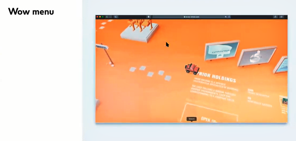
It’s important to understand the author’s purpose in creating such an interface. This designer probably does a lot of standard and boring navigation, but he can also create something unusual. There is no better place to do this than on a personal website, and show potential customers how he can solve standard tasks in an unusual way. You can see many interesting finds on his website: a car can go in other directions, knock down bowling pins, etc. Just exploring the navigation itself will keep you hooked for a long time here.
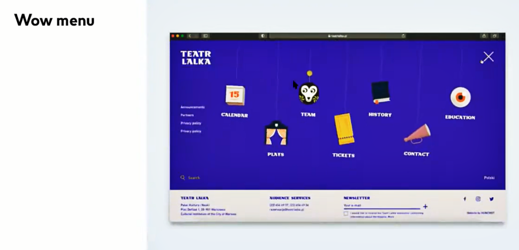
Another example of a menu with a wow effect is a puppet theatre website from Poland. Here, the navigation items drop down from above and swing around on threads like puppets. All these effects create a special atmosphere to the resource. Indeed, if it is possible to play with the theme of the website, it should not be a standard navigation, like for the online store. It is true, the navigation of the store is purely functional: people come for the product, and they need a simple and clear solution. But if people want to see Bruno Simon’s craftsmanship, it’s worth showing it in the most possible creative way. On the theatre’s website, people look at its poster and buy tickets, but unusual navigation also creates the relevant entourage.
Checklist for navigation
As a conclusion, we suggest you to think about questions like these when you work with the navigation:
● Do you have some important items which you do not wish to hide on both the desktop and mobile version?
● What can be visible in the navigation and what would be better to hide?
● Do you need the search bar? Is it a key action, can you do it with an icon or hide the search bar at all?
● If the service is big, how can your navigation improve the user`s experience?
● Will it be breadcrumbs? Do you need to take something out of the depths, can you sort them in alphabetic order, should you break down the navigation itself into stages?
● How should the states of the navigation items be shown, where the user is and where he/she can navigate to?
● In what order would pages and sections be arranged?
● Should the menu be fixed at the top when scrolling?
● Can you remove some sections of the menu?
The last point is worth talking about separately. Previously, the “Home” section for returning to the home page of the website was a frequent navigation item, but now it occurs less and less frequently. After all, people have accustomed to go to the front page just by clicking on the logo. However, as experience shows, Western customers still often ask to add a separate menu item for the home page. Therefore, this issue should be approached consciously and thoughtfully. Actually, as with all other details in navigation design.
Remember: working with design patterns, you should understand which tasks each user should solve and how exactly. Relying on this information, you can design your interface in not just attractive way but also make it functional and human-friendly.
