How can you talk about serious stuff like Data Analysis and Business Intelligence over memes? Memes explain complex concepts and processes. An understandable format of jokes helps to understand many aspects of Data Analysis. How exactly, you will find out from this article.
This material will be helpful for those who want to try themselves as analysts. Professionals with practical experience can look at a well-known topic from an unusual angle.
What is Big Data?
There are many concepts by which the term is explained. NIX experts prefer the 8V scheme:
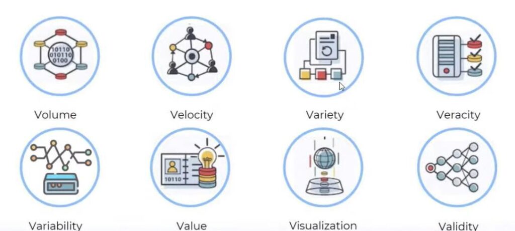
- Volume. If you have a gigabyte of data, it only counts as big data in terms of volume.
- Velocity is data generation, update, rate, and analysis speed.
- Variety—a variety of data, availability of different sources. Big data can be in any format: (un)structured, with the same structure, or diverse and very complex.
- Veracity is truthfulness to help determine if the data comes from a reliable source.
- Variability. Volatility is when data contains different data types and is displayed in other formats.
- Value is the business value of the data.
- Visualization. There is a widespread opinion among analysts: that if the data are not presented in a meaningful way, there is no point in analyzing them.
- Validity is a property of big data that shows how well the data fits its purpose.
In practice, the most important are the volume, speed, and variety of data. The rest of the characteristics are somewhat similar and just contribute more details.
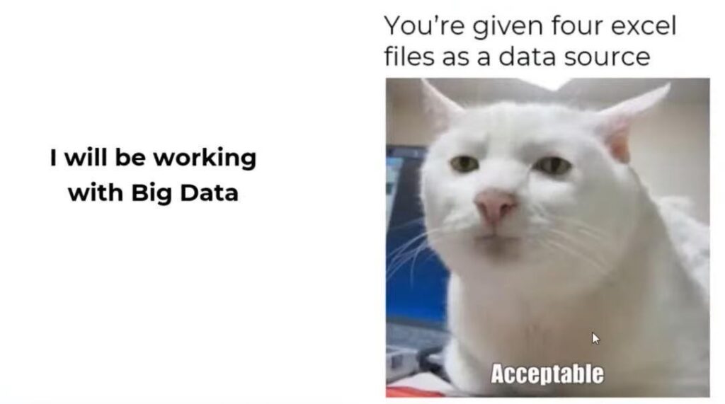
When you hear about data analytics, you first expect to work with big data. In reality, you can have several large Excel files that need to be merged and used as a data source. However, the operations can be much more complex. For example, include cleaning the data and establishing links between the files.
Here’s an exciting trend. The COVID-19 pandemic has caused a historical change in handling large amounts of data, which can cause data to age very quickly. This disrupts many production algorithms and models of artificial intelligence and machine learning. The Gartner study predicts that by 2025, 70% of global companies will change their focus from big data to small and big data. These are the ones that reduce companies’ reliance on big data.
What the Work in a Data Project Looks Like
To avoid confusion, let’s define the meaning of the acronyms DBA and BDA. DBA (Database Administrator) refers to the role of a Database Administrator. BDA (Big Data Analytics) refers to business data analytics.
Business data analytics is a set of methods, techniques, and practices used to continually examine, repeat, and investigate preliminary and current business data. This information lets you understand what data and actions can improve your decision-making process.

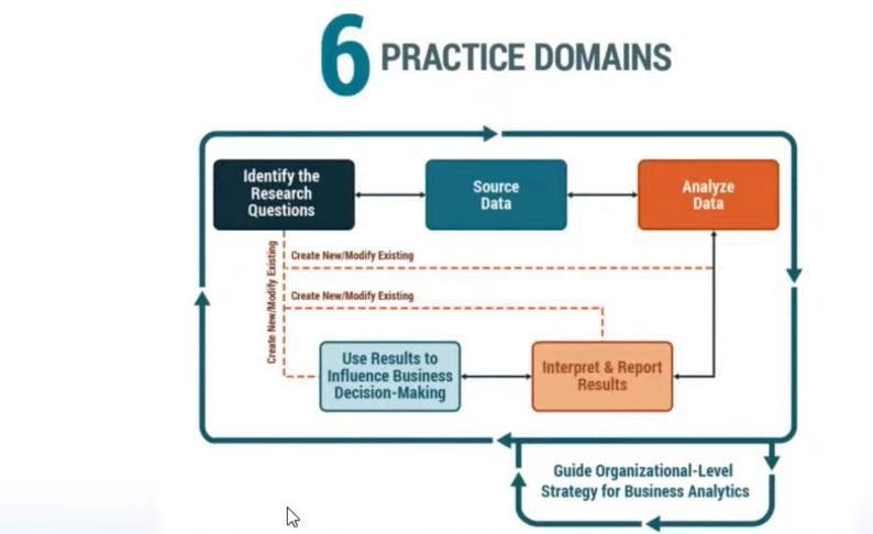
The business data analysis process has six steps:
- Identify research questions.
- Find the raw data—that’s how you can get answers to the primary questions.
- The data analysis itself, during which more questions may arise. Perhaps you will return to the second point and change the first questions.
- Interpret the results obtained. At this point, you can return to the origins of the first stage.
- Use the results to make an accurate business decision.
- Managing business knowledge strategy at the system level is a red thread that runs through the entire flow.
After getting all the vital information, you should find out if the project has documentation and data models, data schemas, or at least one of the above.
Sometimes analysts feel like the character in the meme below. Every time they start a new project, they cross their fingers and think, “Maybe this time I will be lucky, and the project will have actual documentation or at least some of it.”Unfortunately, in practice, they have to deal with insufficiently documented projects.
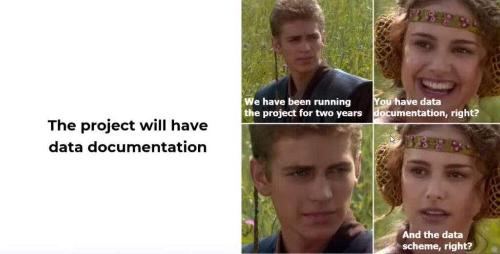
If you’ve been working on a project since the beginning, say a year, and you need to change specific business rules or business logic, you may not remember why any rules were applied in a particular place. When it’s documented, there are no questions. Otherwise, you’ll have to spend time and effort recovering that information.
Let’s look at the main types of documentation you can deal with in a data project:
- Dictionaries and glossaries. This is a list of terms used in the domain. When you start a project and start adding them to your knowledge base, these terms will help you speak the same language as your colleagues.
- Entity Relational Diagrams. Necessary to understand what a business solution model is.
- Database schema. Database administrators need to create this kind of blueprint, and developers need to populate the data in that database.
- An initial report on data collection. This describes what data is needed, from which sources it was taken, and at what stage it was removed or add it to the final version.
- Data quality report. This collects information about whether there are gaps in the values, whether their reasons are known, and whether there are inconsistencies in filling some fields.
The table shows an example of a data dictionary. Its templates may vary, but the primary columns are usually name, definition, and data type. Sometimes even data stores can create such a template. If you have different data sources, they probably won’t have the same structure. So it’s better to keep them in one place and give your colleagues the same structure format. And there is already a tool to help you do this—data catalogs.

Data Directories: What is Their Use for Data Analysts?
Catalogs combine metadata about the big data available and help customize your company’s data management process. The most remarkable thing about directories is that they can create a piece of documentation for you.
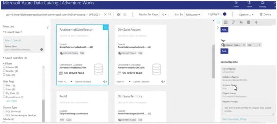
You can see several screens from the Azure Data Catalog in these screenshots. Here is the explanation of its features in more detail.
- The catalog has data sources you can use to search for information, use advanced searches or some filters, and add tags to make searches easier. You can find an access request window for each data source and place information about all the steps to access that source. If the organization is large, sometimes gaining access can be a problem, like looking for a black cat in a dark room. If you keep all the information in one place, you will have clear step-by-step instructions. First, you need to fill out a form and get approval from a manager. Next, send an email to support. As a result, you will have easy access to the data source and save yourself time.
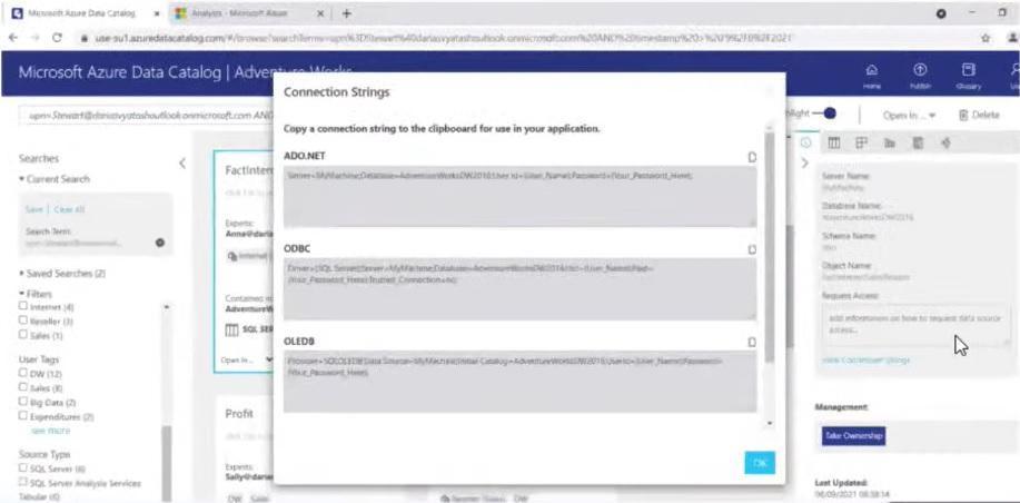
- Another exciting feature is that data directories can generate Connection Strings. In the case of Azure, you can connect to a data source, such as Excel or Power BI. The directories do not load the data directly into Excel but create this connection. Once you add credentials, you can access the data itself.
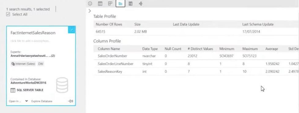
- There is a lot of helpful information for each data resource. For example, data profiles, main field properties, etc. You can preview the data, so you don’t need to make a connection to the source and run a query. You just look for the data you want and see the types of data, columns, and values. And another exciting thing is the origin of the data. You can go step by step from the source where you get the data to the creating dashboard.
- I want to talk about the glossary. As it was mentioned before, this is the most important type of documentation. You can store all your terms in it, approve them with the administrator, and add parent terms to create a specific hierarchy. You can also link them to date objects and see fields where you can join tables with each other.
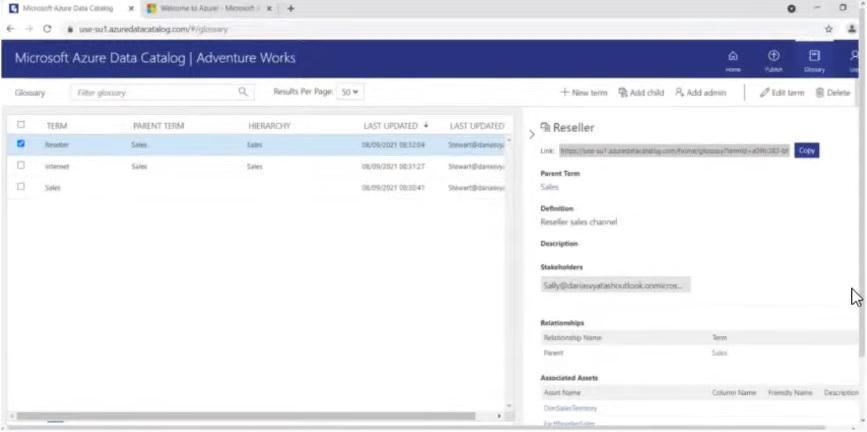
As you can see, data directories are a convenient tool to work with.
What’s Important to Know About Dashboards
One of the goals of working with stakeholders is to make them happy. Sometimes, however, despite all efforts, this is not achieved.

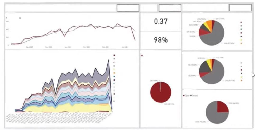
Let’s explain the application of a common situation. A stakeholder contacts the team with something on the dashboard mockup shown below. He wants to see the data for all products at the same time. And he wants to see all of them—KPIs, columns, circle diagrams, etc. You can change your mind if it’s not the best solution…

The problem is that the horizontal length of the dashboard is quite large. There is too much stuff in it. Usually, analysts tell the stakeholder about this right away. But often, the client insists on implementing everything according to this layout. After completing the development while showing the dashboard, the customer will likely be unsatisfied with what they see and explain this in the following way: “I thought everything would be less horizontal.” What to do in such a situation?
First, separate the dashboards by-product: one panel, one product. Then you need to change the design, where the metrics are arranged more thoughtfully and transparently. You can switch between products by changing the filter value. To compare products among themselves, you can create a summary table with the values of characteristics. See what it might look like:
Make Interactive Dashboards
Dashboards should be clear and useful to customers. And visually beautiful dashboards also look more attractive. Interactivity will make working with data more effective. How?

- The liveliness of decision-making. This is an interactive analysis that helps users answer critical business questions based on new data. They can be seen from a different perspective in just a few clicks. So the cats in that famous meme will always know the price of today’s fish 🙂
- Avoid redundant reports. Instead of creating ten static slides in PowerPoint, you need only one tool with interactive features for quick image adaptation. Although, you may encounter clients who need to export dashboards specifically to PowerPoint presentations.
- Less IT involvement. The company can save time and other resources by allowing users to perform their own data analysis. In turn, IT will be able to focus on its own immediate and strategic tasks.
- Quickness. With traditional spreadsheets and PowerPoint presentations, data has to be manually inserted and updated. Modern dashboard tools make life easier by updating data in real-time. That increases the speed of getting answers.
- Performance. The volume of data to collect and analyze is constantly growing. Therefore, static tables with millions of rows and columns no longer work. But interactive BI tools allow users to interact with data independently and use technology to improve their productivity.
Let’s move on to the embodiment of interactivity on the example of one dashboard. Try the following popular features:
- Dashboard Chart Filter/Click-To-Filter. You can click on certain data items and filter them out that way. For example, you click on Australia here, and all KPIs and other metrics are filtered out. You don’t need 20 additional filters on the dashboard. This way you can save space and make your dashboard interaction convenient and easy to understand.
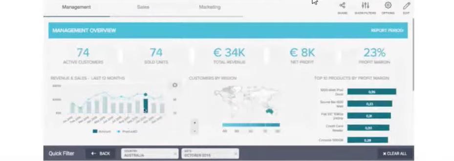
- Drill-Down / Crosstab Filters. These drill-down and crosstab filters allow users to look at data from different perspectives. For example, expand the KPI value for a more detailed view and cut, as in the example below. This will take you to another visual with the same set of filters. Crosstab filters, on the other hand, are valid for multi-page dashboards. Suppose your report has ten pages, and each page has six filters. Users will spend time setting the same values for each page. And this way, you will synchronize the value of the filters and help them save effort.
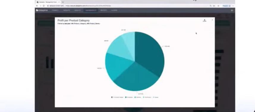
- Drilldowns. With drilldowns, you can add hierarchy to the data display. So you can go from information by quarter to month or day, from categories to subcategories, from channels to countries associated with those channels:
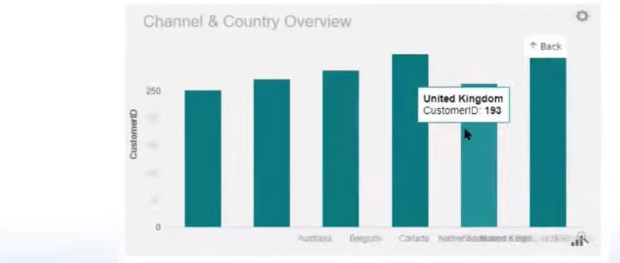
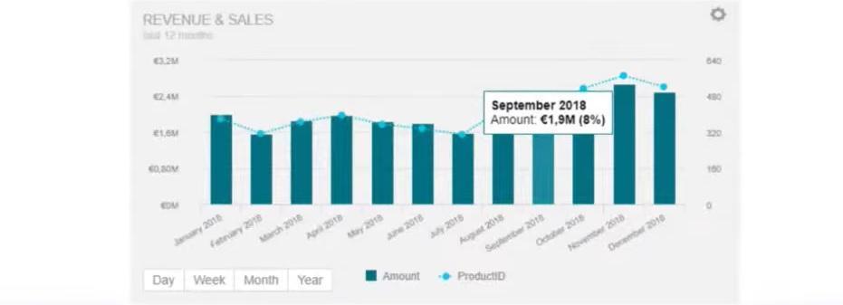
- Custom Chart Tooltips. These are special chart tooltips. Typically, best practices recommend that you use all of their features to show additional crucial points about your data. In this way, the information becomes more meaningful. You can place text descriptions and add other visuals.
Teach Users How to Work With BI Tools
Imagine that previously users worked only with some Excel spreadsheets or PowerPoint slides and charts. They have now started using a BI tool such as Power BI or Tableau. At this point, they don’t need every possible function. In fact, for their purposes, they would be sufficient with just the figure you got from the reports.

At first, the features of dashboards can be overwhelming to the user. So be prepared to spend a lot of time explaining to them all the features of the tools. The main goal of your QA sessions should be to show the benefits of these tools. You have to sell them this BI tool.
You can also create instructions to help users. By familiarizing them with BI analytics tools, you increase their productivity. Of course, a lot depends on people’s motivation here. But the willingness to invest their time and knowledge in them should be a company policy.
How to Improve Teamwork on the Dashboard
Many analysts want to work on dashboards themselves, but in practice, you will more often collaborate with several specialists. Here are a few life-saving tips to ensure that the work is done efficiently and that everyone is satisfied with the process and the overall result.

The first recommendation is to define rules by folder names, dashboard headers, calculations, etc. When drawing a parallel with some software development methods, you could set up Power BI or Tableau servers online with dev, test, and production folders. This would help qualitatively test and deploy the project in the right environment and ensure everything is OK. It also helps to share knowledge, especially if you have a newcomer on the team. Thanks to the exact names of all the elements, everyone will be confident working with ready-made dashboards and new data.
You can also try other software engineering methods:
- Version control systems (Git). If there are only two analysts in the project, it is more convenient for you to send each other files via messenger. In the case of a growing team, you need to get the process right from the start. With version control systems, you can see all the changes in the project at any time and quickly revert to a previous version.
- Comments. With these, you can see comments, methods, or new features implemented on the dashboards. It is also helpful to avoid only the “latest” version of the report 🙂
- Pure code. There are many open source toolkits for some BI tools. They will help with formatting and code cleanup.
- CI/CD automation. For example, in Power BI, you can automate the deployment pipeline using APIs and Azure DevOps.
BI Tools for the Data Analyst
Let me tell you right off the bat: there is no perfect full-featured tool. Sometimes when you work with some obscure tool, you can’t even change the colors of the categories, although well-known tools have weaknesses. For example, Tableau has almost no ETL. You have to use a separate program called Tableau Prep for that. Or Looker, one of the most expensive BI tools, but you can’t change the tooltips in it. So, different BI tools serve other purposes. Their choice depends on the specific tasks and conditions of the project.

Another vain hope of beginners: it is enough to master one tool to become a pro. However, you may encounter different BI tools in various projects. When you understand the principles of their work well, you will quickly master any new tool. Basically, they all have the same logic—based on SQL and drag-and-drop functions.
So what should you do if the BI tool does not achieve the desired result?
- Look for workarounds. During the conference, the experts cite the following situation: after publishing a dashboard to the Power BI server, one of the server updates disabled the save button. This would result in the inability to configure automatic dashboard updates on the server. After some research, the team found a solution: replace the state of the button by enabling it with HTML.
- Communicate with the community of BI tool users. You can always ask them for help when you need it. Some tools also provide additional paid support. For example, Tableau has premium support. It significantly speeds up the processing of problems and getting answers. After all, support workers are more immersed in clients’ tasks and quickly help to solve problems.
- Submit requests for new functionality. If you are working with a BI tool that is not well known, sometimes you can talk to its developers. For larger projects, developers may even arrange sessions with analysts. You can learn about new features or edit existing ones during such discussions. As for well-known BI tools (like Power BI), you can post your idea on their forum, where the same users can vote for it. Then maybe in the future, the developers will notice your suggestion and add a new feature in the next version of the product.
In addition, experts expect errors in the tools to be clear and have clear steps to solve them. However, sometimes you don’t get a detailed explanation, only an error number. For example, the Pyramid BI tool has only a code of numbers and letters. So it is challenging to fix the error because there is no documentation about the tool, and no one has encountered such a situation. If this is the case, you can seek advice from your colleagues on the project or from the IT community. Besides, you can reproduce all your actions step by step to find out exactly where something went wrong.

One last meme to make you smile. What do you call this BI tool? Experienced analysts might mention many versions: Tablu, Tablyu, Tablya, and finally, Tablo.

We’ve made some jokes, but now let’s end on a serious note. Here are some more useful tips from NIX experts for working in data projects:
- Take the time to create all the data documents. Use external tools as needed and keep your documentation up to date. Improve your life in this way.
- Work on the interactivity of your dashboards. Use every possible feature, but do it wisely—step by step.
- Keep an eye out for new features in your BI tools frequently. Seek help as needed and communicate more regularly with others on your team.
